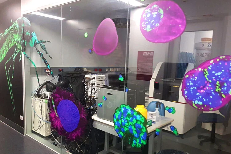
Top image: Centre for Dynamic Imaging
Brief: Create an educational tool that accurately represents the malaria life cycle, to scale, using images captured on equipment within the facility. Adhere to OH&S requirements for the space, coordinate production and oversee installation with suppliers.
Outcome: This display is the first of its kind. Successfully met the requirements of all stakeholders; facilities management, centre manager, researchers and internal communications.
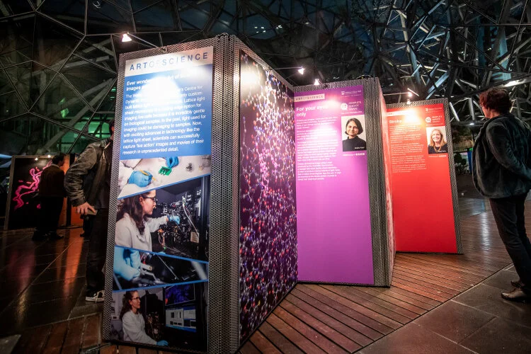
Middle image: Art of Science Exhibition
Brief: Re-design the annual Art of Science exhibition held at Federation Square to engage a larger audience to increase brand awareness. Curate experience, source suppliers, oversee installation and design an emergency contingency plan for the display.
Outcome: Achieved 82% increase in public engagement the first year. Shortlisted finalist in the Melbourne Awards, Arts and Events category and I won the Employee Engagement Award for the project.
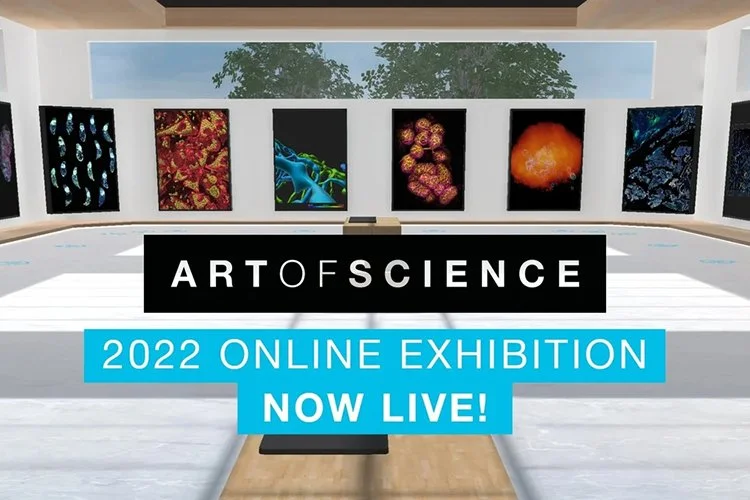
Bottom image: Virtual Art of Science Exhibition
Brief: Transform the Art of Science exhibition into an interactive online space during the pandemic, continuing to increase brand awareness. Source a virtual host and developer.
Outcome: Achieved over 100,000 global impressions by creating a virtual exhibition space users can navigate and vote for their favourite image. Collaborating with the MSO was a highlight and I co-won the Employee Engagement Award for the project.
Designed and developed donor reports, annual reports, strategic reports, course brochures, programs, catalogues, calendars, book covers, wellness trackers and zines.
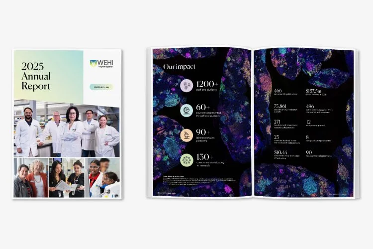
Top image: Annual Report
Brief: Re-design the annual report to align with updated brand style guide and visual language. Advise on iconography, implementation of new brand colours and layout throughout publication.
Outcome: Successfully advised project manager to establish parameters around secondary colour usage in publications that filled the gap in new brand guidelines. Exceeded stakeholder expectations and established a template that can be used when engaging contractors.
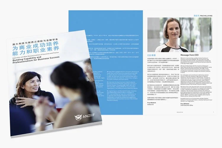
Middle image: Dual-language brochure
Brief: Typeset and design brochures to strict brand guide in English, Chinese, Thai and Vietnamese for distribution across Australasian region.
Outcome: Neatly formatted brochures with breathing room around both languages featured in each edition.
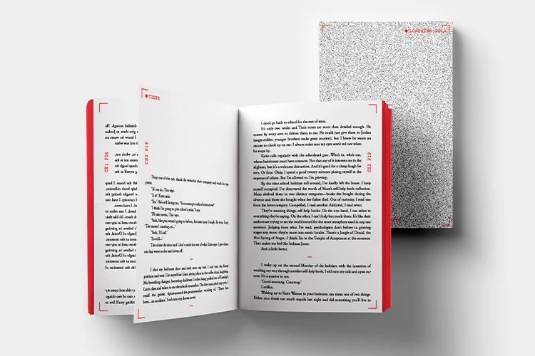
Bottom image: Loathing Lola
Brief: Cover, chapter page and page layout design for YA novel. Exploring themes of obligation, manipulation, reality television, fame and consent.
Outcome: Feedback from the author was that it successfully captured the disconcerting feeling and undertones of the book. He pitched it to his publisher.
Experience designing within strict brand guidelines for print and digital assets, publications and large-format materials. Creating logos, user guides and developing sub-brands within existing brand guidelines and anniversary logos.
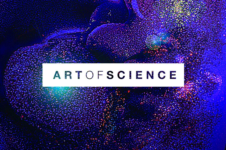
Top image: Art of Science
Brief: Design the annual exhibition’s brand mark to be applied across all promotional and event assets alongside host organisations logo. Diabetes Research Centre
Outcome: Successful logo that is legible and easily reproduced at all sizes in print and digital. Timeless, bold design has been used for 9 years developing brand recognition with donors.
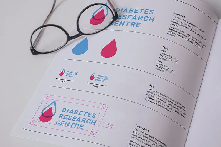
Middle image: Diabetes Research Centre
Brief: Create a logo using diabetes awareness colour; light blue, brand mark representing their research ‘filling the gap’ and develop accompanying one-page user guide.
Outcome: This was successfully implemented by the research team on scientific posters, EDM newsletters and registry.
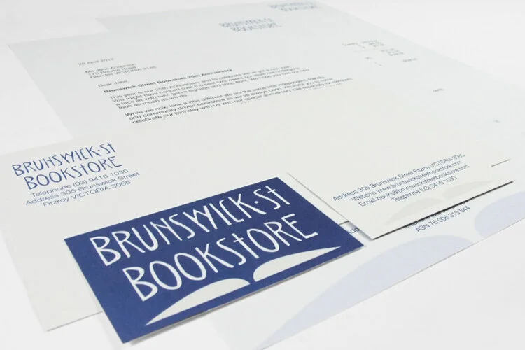
Bottom image: Brunswick St Bookstore
Brief: Design a two colour brand identity for spot printing including concept logo using a custom font and roll out across business stationery.
Outcome: Store manager engaged with the concept and presented it to the owner.
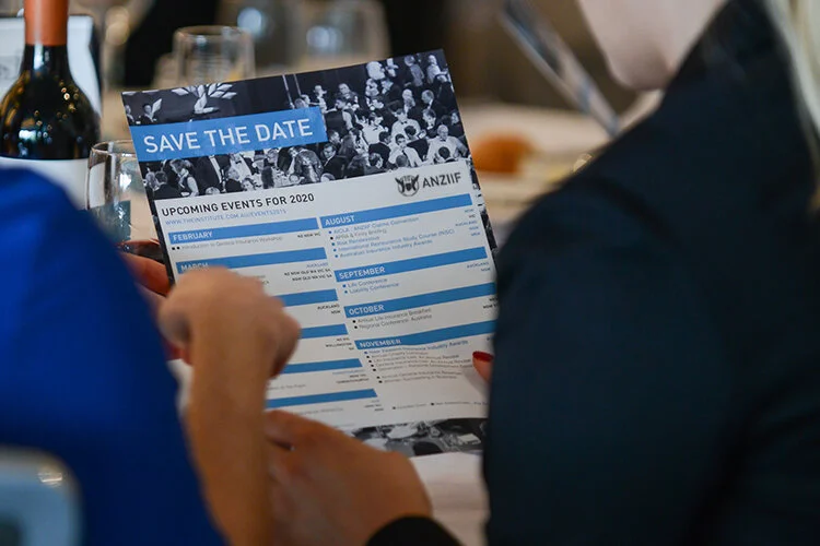
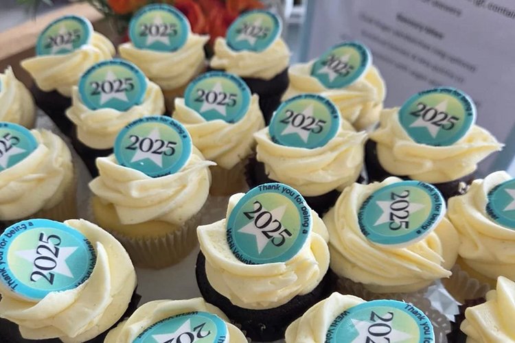
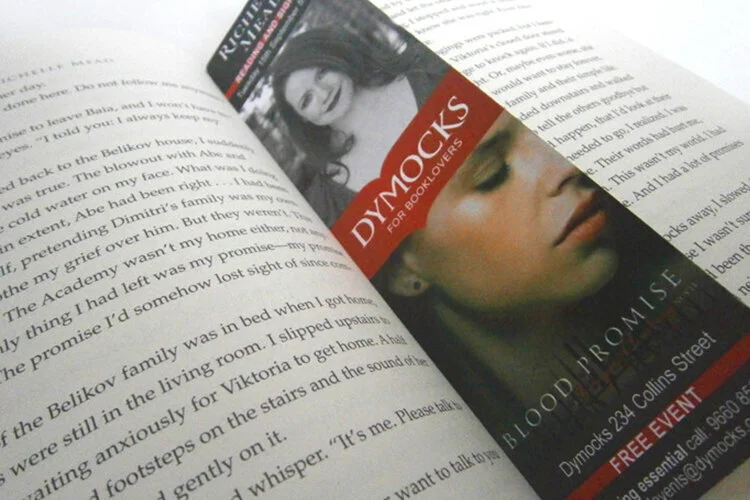
Images top to bottom: Save the date flyer, Cake toppers for volunteers event and promotional bookmark.
Promotional assets:
Social media images/assets, web banners, web ads, presentation slide decks, digital signage, trailer video direction, posters, flyers, leaflets, bookmarks, postcards, invitations and EDM; banners, images, button, style direction.
Pre-event planning:
Self-service templates, user guides, floor plans, design production budget management and oversight.
Event day assets:
Programs, menus, badges, cake toppers, certificates, ceiling banners, media walls, pull up banners, name tags, seating charts, booklets, signage, wayfinding, gift bags and specialty packages such as archival prints and gift cards.
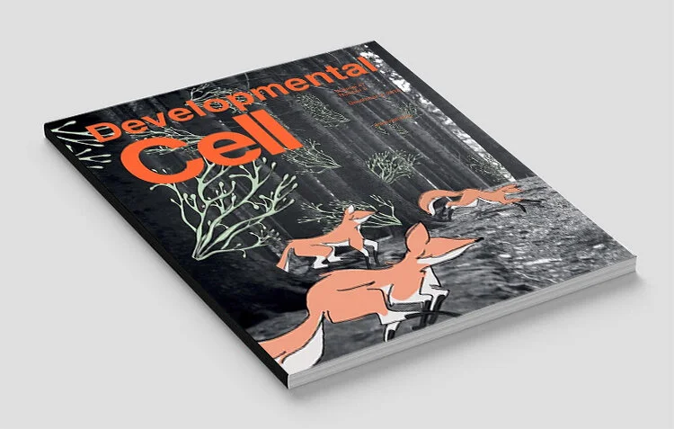
Top image: Developmental Cell
Brief: Illustratively represent research discovery that the protein FoxP1 awakens sleeping stem cells in the mammary gland.
Outcome: Winning cover art selected for scientific journal Developmental Cell after collaborating with Professor Jane Visvader and Dr Bianca Capaldo to understand their research.
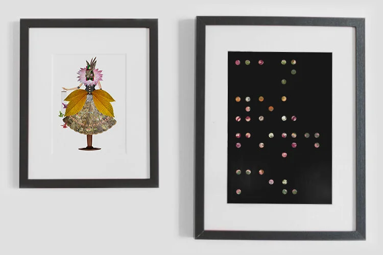
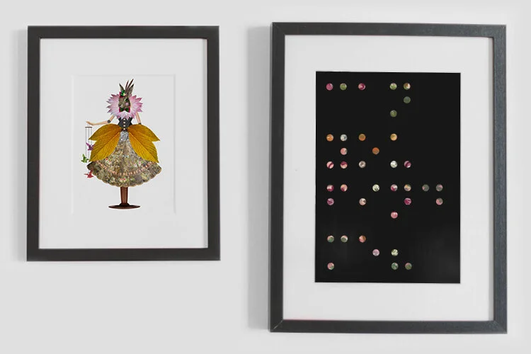
Middle image: Illustrative responses
Brief: Create digital collages that engage the audience with a sense of wonder to the prompt ‘hidden’.
Outcome: An Alice in Wonderland inspired collage that was adapted to an animation symbolising breaking free of our own expectations (left). A poster print that in brail reads ‘Can you read me?’ (right).
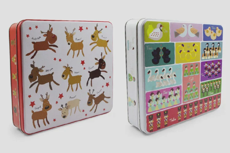
Bottom image: Seasonal biscuit tins
Brief: Digitally illustrate two biscuit gift tins for the festive season using to a supplied die-line. Manage overseas suppliers through the production phase.
Outcome: Sold out in their first year, artwork licence was renewed for an additional three years totalling four years stock and sale at Target.